Fighting Bias in Voice Artificial Intelligence
Background
The world is becoming increasingly digitized every year. One of the ethical challenges it faces is adopting inclusivity and tolerance for all values. In the first part assignment for this project, I analyzed how various AI (Artificial Intelligence) powered devices can be biased against different groups of people.
The Problem
I decided to narrow the “Bias in AI” topic down to the AI voice technologies that recognize real-time human language and respond to it. Recent studies show that voice recognition technologies are still biased against groups such as older people and males versus females (with a preference towards females). However, individuals with a non-native English tongue are the most affected by biased voice technologies. So the question to consider is:
How might we fight bias in speech recognition and NLP (Natural Language Processing) technologies so that technology solutions are inclusive for all?
DISCOVER (RESEARCH)
Exploratory Research
Key findings from the exploratory research
1. Today’s natural language processing and speech recognition algorithms are unintentionally biased against various groups of people.
2. The worst affected group is non-native English speakers and people with distinct accents.
3. This results in increased financial costs due to additional customer service time, user disappointment, and decline in customer loyalty, and the opportunity cost of missed sales for home speech recognition devices.
Origins of AI
AI is a research field that has been around since the 1940s. The whole idea of Artificial intelligence is to try to understand the nature and design of “intelligent agents”.
AI aims to find a way to artificially mimic human thinking, feeling, and other human features. With modern technology, we have never been closer to achieving this aim.
Machine learning is a subdivision of AI that has gained a lot of applications in the business world. In machine learning, experts do not have to provide knowledge of the system.
What is Bias in machine learning?
If they favour one social group against another, machine learning algorithms will continue doing that, forming preferential bias towards or against one social group.
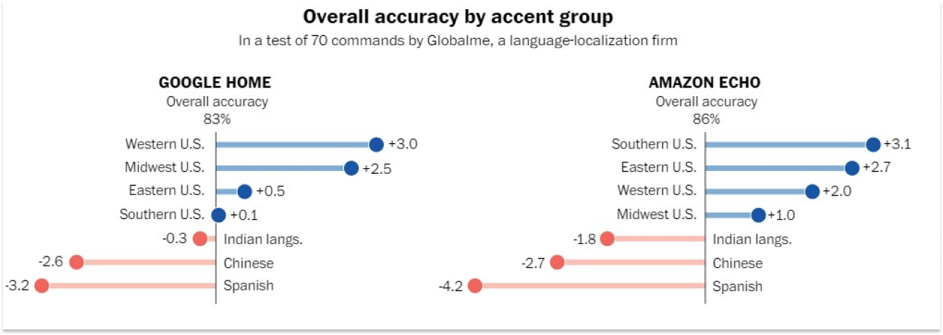
The Washington Post collaborated with two research organizations to evaluate thousands of voice commands given by more than 100 persons in nearly 20 cities to examine the accent imbalance of intelligent speakers. They discovered that the systems revealed significant differences in how individuals from various regions of the United States are perceived.
However, those with foreign accents experienced the most significant difficulties. In one investigation, the system demonstrated that speech from the test group had roughly 30% more mistakes when compared to what Alexa believed it had heard:
Explanatory Research (Challenges in the NLP Sector )
Key findings:
Research Process & Approach
In my research of the challenges for the NLP sector, I continue looking into available studies and literature, hoping to:
1) Understand how the NLPs work;
2) Figure out what the touchpoints for the user experience are;
3) Look into possible reasons for biases.
What is NLP, and how does it work
There have been many attempts to define or summarise what natural language processing is. In general, it attempts to comprehend written and spoken language using technology. As mentioned above, the modern NLP is tackled by artificial intelligence and Machine learning algorithms. NLP has many applications, such as text recognition for web scraping, automatic article writing, analyzing user-generated content for censorship, and many more.
Classification of NLP algorithms
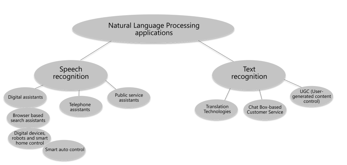
At a very high level and by function, we can categorize NLP technologies into two main types:
- Speech recognition technologies
- Text recognition technologies.
Most NLPs are “hidden” from the user, and the user never gets to interact with them. However, some NLPs have direct access and interaction with the users, and for this research, I will only be looking at them.
Top Three Commercially Available NLP APIs For Speech Recognition
1. IBM Watson Speech-to-Text API
- Transcribes English speech to text;
- Provides developers with speech transcription abilities for applications;
- Speech recognition accuracy is dependable on the quality of input audio;
- Service only transcribes words it knows.
2. Google Assistant API
- Can be embedded into devices to enable voice control;
- Provides a way to have a conversation with smart devices;
- Voice control for phone applications, speakers, smart displays, automobiles, watches, laptops, TV, and other Google Home devices;
- Allows to conduct a search, manage tasks, add reminders, and control home devices.
3. Houndify by SoundHound
- Voice-enabled conversation functionality
- It enables developers to integrate this functionality into their apps or create new ones.
What Causes Biases In NLP Technologies?
According to the Washington Post article (reviewed in the previous chapter), Algorithms need diverse inputs to learn and ultimately understand different accents. However, data Scientists say that too many people training, testing, and working with the systems sound the same. That means accents that are less common or prestigious are more likely to be misunderstood, met with silence, or the dreaded “Sorry, I didn’t get that.” (Harwell, 2018).
In other words, one of the main functions of the algorithm is to self-educate and self-correct. However, NLPs face the toxic feedback loop as those exact user groups who would be the most beneficial for the algorithms to listen to avoid talking to it due to shame and frustration of not being understood.
User Interview and Testing
To better understand and empathize with the users trying to use the NLPs, I conducted quick user research with one of my close friends, a non-native English speaker with a strong accent.
I asked him to perform five queries* with Google phone assistant:
- Please find a carrot cake recipe.
- How long does it take to drive to Wexford from Bray?
- Who is the tallest man on the planet?
- What year did the first moon landing happen?
- What are the opening times in Smyths Carrikmines today?
Google Assistant was great at catching everything he said. After the test, I conducted a short user interview that facilitated building the empathy map that led to developing a primary persona in the Define/Synthesis phase.
Note: this research does not indicate real-world situations because users do not ask pre-formulated questions in the real world. However, I was more interested in his feedback and thoughts than the performance of Google’s NLP API.
DEFINE (SYNTHESIS)
Affinity Diagram
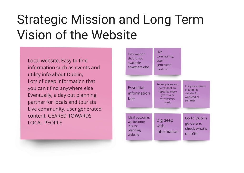
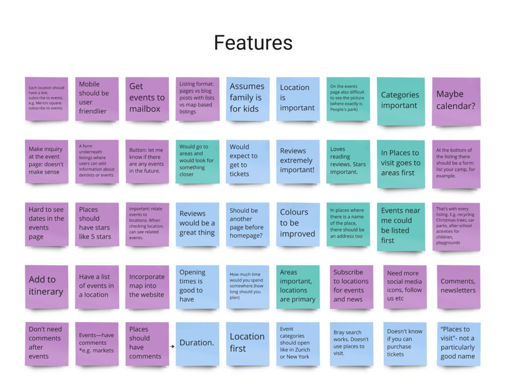
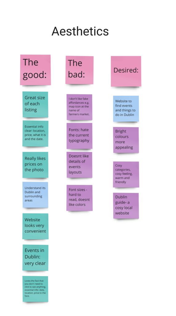
I started the “Define” phase of the UX Process by synthesizing user research findings in Affinity Diagram. First, I reviewed User tests and noted the meaningful insights on post-it notes. Then I categorized the messages into distinctive categories. Different colours mean different respondents (users and stakeholders).
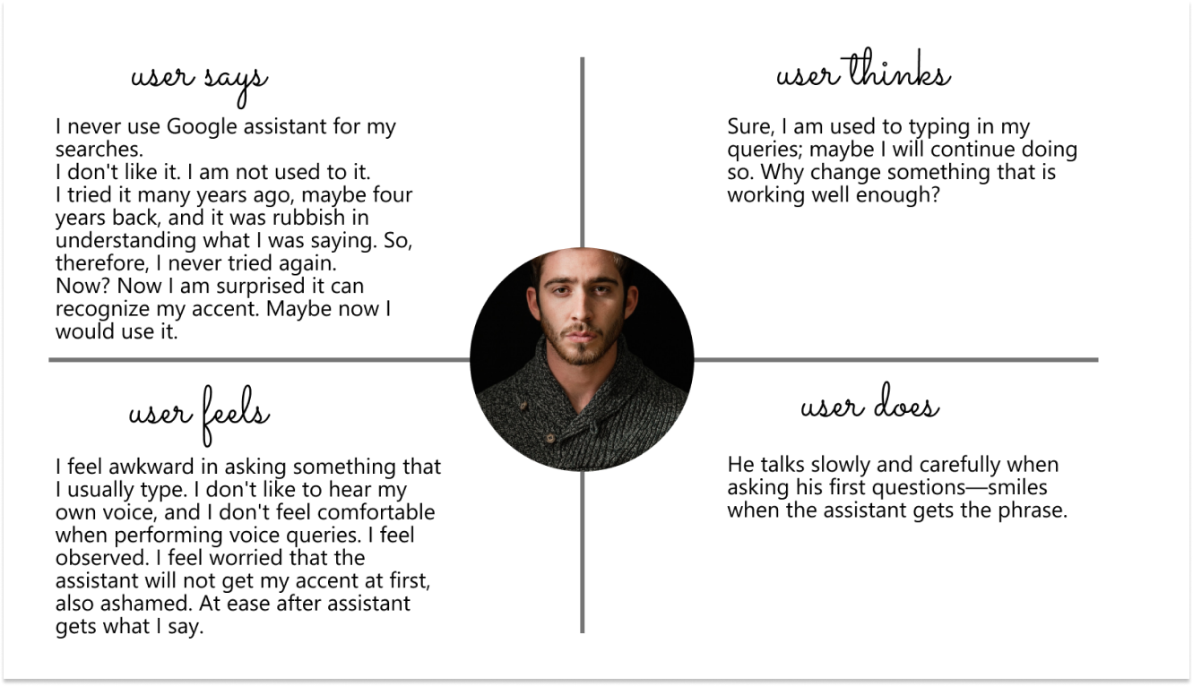
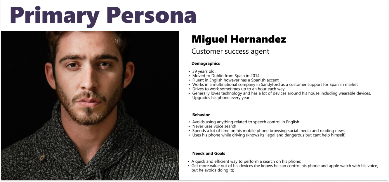
User Empathy Map and Persona
User Pain-Points interview and testing facilitated building the empathy map that led to developing a primary persona – Miguel Hernandez.
DEVELOP(IDEATION)
Ideation Techniques
Mindmapping
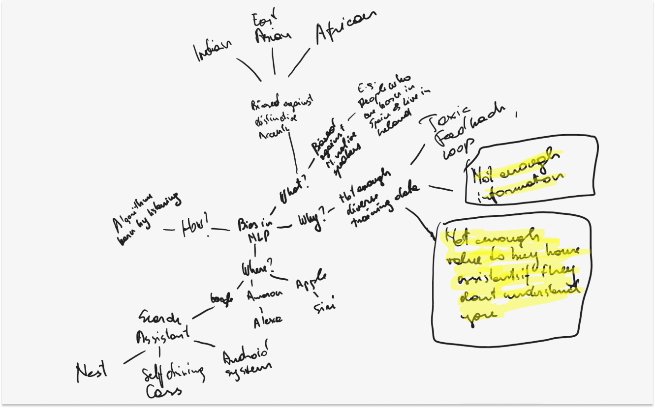
During the exploratory and later explanatory research, I gathered a lot of information about the bias in NLP Algorithithms and the effect on users and businesses.
Using the mindmap technique in this proposal
The mindmap I came up with (Figure1) helped me understand that I should focus on finding ways to increase diversity in voice input data.
Crazy Eights
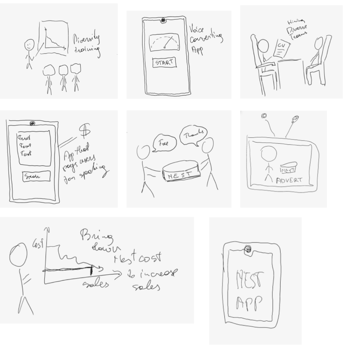
The next step in the ideation process was coming up with as many ideas as possible. I thought the most suitable way to develop rapid ideas was to use the strictly timed Crazy 8s technique.
Crazy 8s for this UX proposal
Using the Crazy 8s technique, I devised eight sketches representing eight ideas for tackling bias in voice technologies. I then discussed the ideas with my UX design lecturer. This discussion was a great help in narrowing down and polishing the final concept.
Rapid Prototype
Journey Map – Context
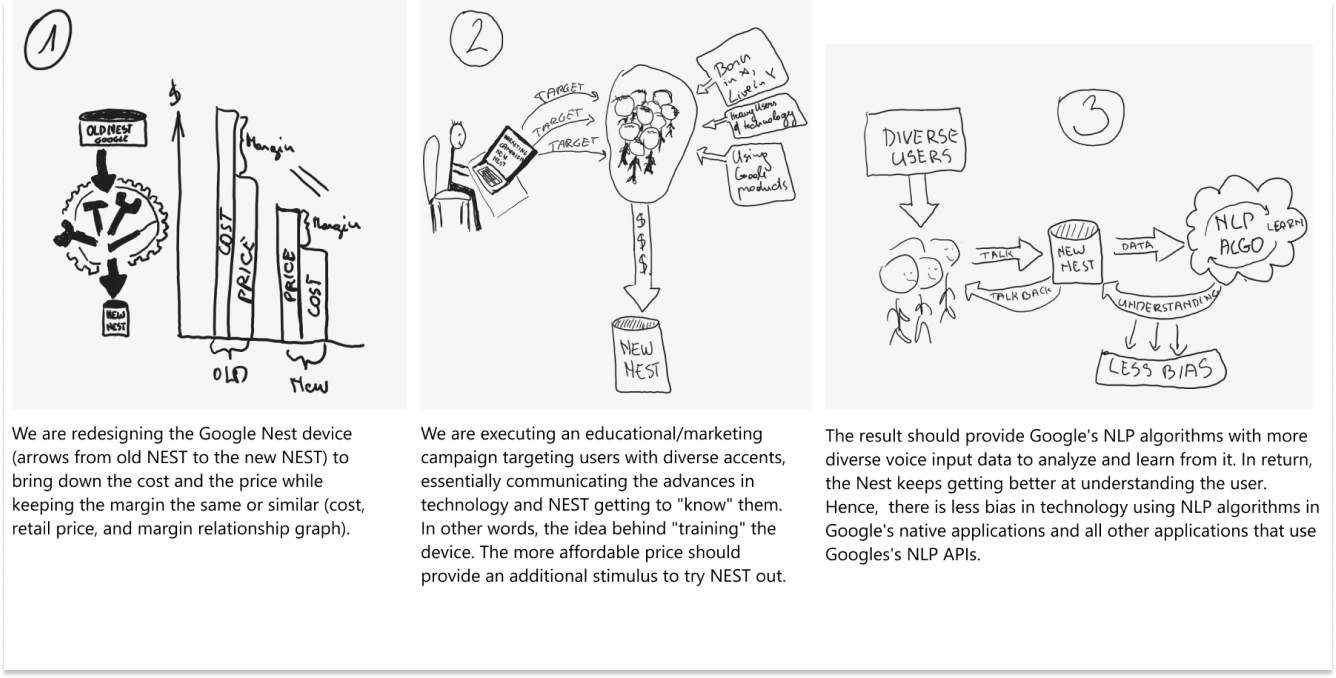
Google is aware of bias in its NLP algorithms and concerned about its NLP API being sold to other companies; it has come up with a solution.
The solution is to design a cheaper version of the Nest device, hoping it will appeal to a broader variety of users and motivate them to buy and use the device despite their worries about their voices not being recognized.
In addition, it comes with an educational marketing campaign targeting the above audience in the US, Ireland, and the UK.
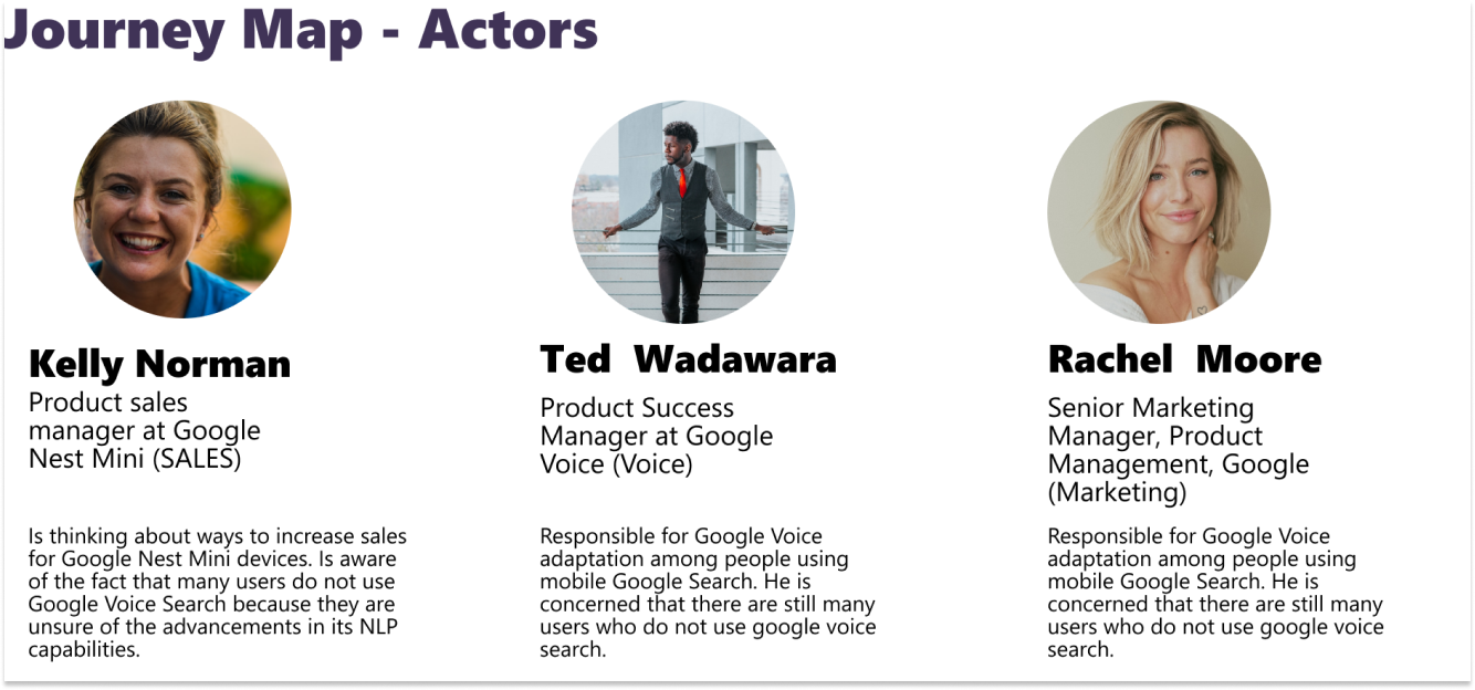
Journey Map
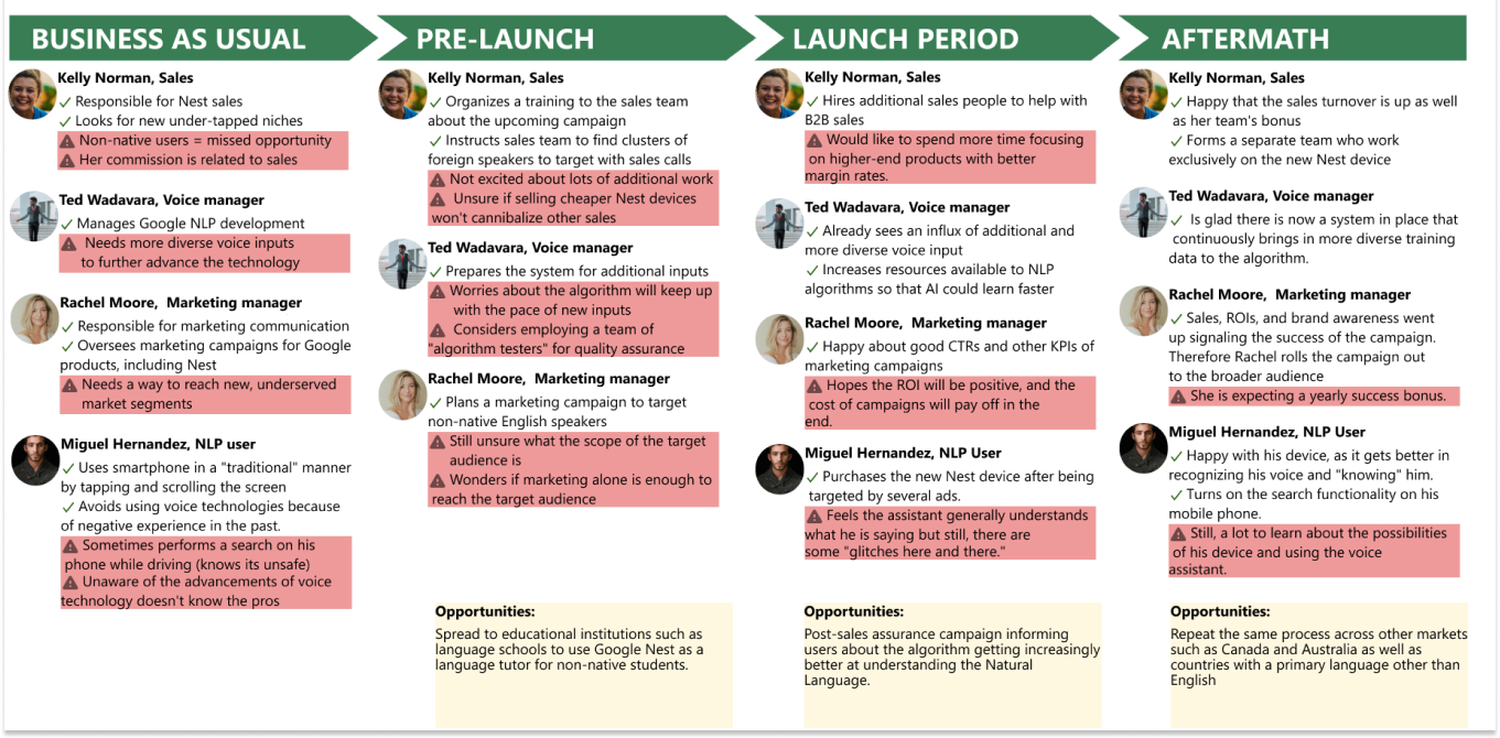
Business Opportunity Discovered
I discovered the opportunity to include a language learning module in the new assistant device. I assumed that only a reduced price alone would not be a sufficient factor for increasing the sales for the device (which in turn would provide it with a broader range of accents).
Therefore, a language training module should serve as an attractive feature and draw a unique range of people with accents that are more difficult to understand (which, in this case, is very beneficial to the algorithm).
DELIVER (IMPLEMENTATION)
Hypothesis Statement
We believe that a new Google Assistant device – Nest Lingua with a well-executed educational/marketing campaign and an English Language Training module will draw a broader range of people to use it. According to our research, this will result in less biased NLP algorithms because of more diverse learning datasets.
We will measure the success by:
1. The sales amount of Nest Lingua devices and the number of people who turn the language training module on;
2. By conducting experiments similar to the Washington Post experiment every six months. We aim to ensure that understanding the accents of distinct languages reaches an understanding of white individuals from the West Coast USA.

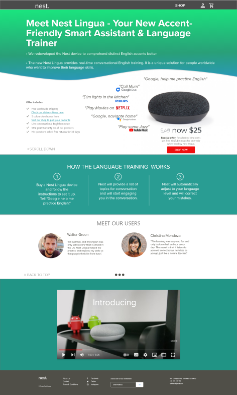
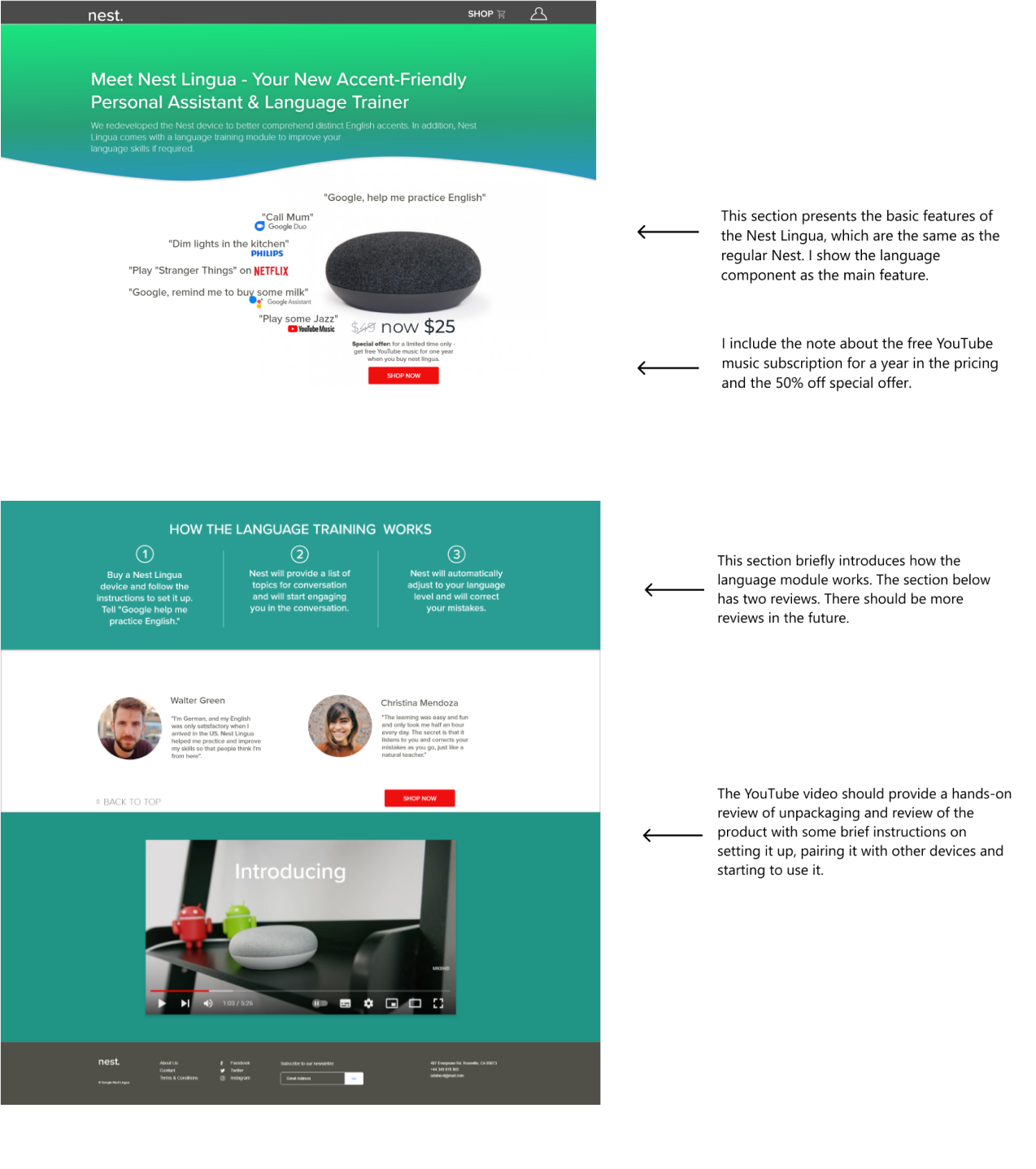
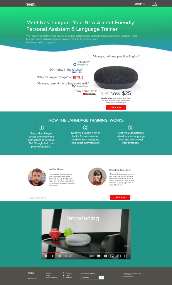
Prototype: Google Nest Landing Page
Unmoderated Usability Testing
User Screening
To perform unmoderated user research, I use a usertesting.com website. It allows specifying a target audience by nationality, interests, occupation and many other factors. They also allow using of screening questions.
Deciding what users to include/exclude from the research was very tough. I was puzzled about limiting myself to English-speaking countries and the rest of the world.
After much hesitation, I decided to opt for all countries and introduced several screener questions. I based my decision on the fact that there are more non-native English speakers worldwide than in English – speaking countries, and I will be more likely to find suitable candidates if I don’t restrict countries.
I decided to look for someone who does not have native or excellent English skills and is interested in improving their English. I wanted to test if the prototype would be appealing for this category.
They would also be technologically savvy as they should know what AI-based assistants are and be familiar with the YouTube Music service.
Testing Social Media Advert
By asking the following questions, I wanted to know if the message was clear if they knew what we were selling and where the advert was leading them. I was also interested in whether the design and composition were appealing.
- This is a sponsored ad on Facebook. Please explain in your own words what you think this advert offers. [Verbal response]
- How likely would you click on it if you saw it in your Facebook feed? [Multiple choice: Not likely, Likely, Very likely]
- In the last question, we asked how likely you would click on this ad. Would you please explain your answer? [Verbal response]
Testing Landing Page
I designed 1-4 questions to examine if the user grasps the website’s purpose, the USP (unique selling proposition), whether the pricing is straightforward and the overall visual attractiveness of the site.
Question 5 seeks to unveil any missing information on the website that I could include. It also provides valuable ideas for the video content.
Questions 9-11: This user research was unmoderated, meaning I could not witness a user trying to use and engage with the prototype. However, I wanted to include several questions to help me know if the website’s navigation is straightforward and if users understand the iconology.
- Here you can see a homepage prototype (the links are not working yet). What do you think is the primary purpose of this website?
[Verbal response] - Looking at this website, what are the main differences between regular and lingua Nest versions? [Verbal response]
- How much is this product? What is included in the price? [Verbal response]
- How visually attractive is this website to you? [5-point Rating scale: Very attractive to Very unattractive]
- At the bottom of the website, there is a video. What would you expect to see in that video? [Verbal response]
- Supposing you’d like to buy this product. What steps would you take? [Verbal response]
- What do you think will happen if you click on the first (from the right) icon on the top bar of the page? [Verbal response]
- What do you think will happen if you click on the SHOP link? [Verbal response]
- How would you improve this website? Is there anything missing (e.g. is there something you would like to know before deciding to go ahead with the purchase)? [Verbal response]
- How appealing is the offer to get a free YouTube Music subscription for a year?
(Multiple choice):
-Not appealing, I don’t care about YouTube Music,
-Not appealing, I already have a YouTube Music account,
-Appealing, I would love to have YouTube Music for a year,
-Not sure yet, I don’t know what YouTube Music is. - What features of the Nest Lingua product are the most attractive to you? [Verbal response]
- What concerns might stop you from buying this device? [Verbal response]
Now retrospectively, I know I made several mistakes when designing this questionnaire. It turns out; users are good at verbalizing their responses, so there was no need to include questions that explain their multiple-choice answers.
Also, I should have included a couple of additional screener questions, such as if they are familiar with youtube music or assistants, as one of the users was utterly unaware of what an assistant is.
However, using userresearch.com for the first time, I was impressed by the quality of responses and the tones of valuable and actionable information I obtained.
Design Iterations: Advert
I tested the prototype and the social media advert with three users. For this research, I will call them User A, User B, and User C. All three are male, in their 20s (20, 29 and 22 years old, respectively). User A and User B come from India and are Indian, while User C comes from the United Kingdom but was born in Middle East Arabic countries. All three are non-native English speakers.
The good:
All three users think that advert is appealing and visually attractive. They love bright colours. User A and User C indicated that they are likely or very likely to click if they saw it in their Facebook feed.
Improvements:
User B said he would not click on the ad because he bought a similar assistant a couple of months ago and doesn’t think he needs a second one.
User A thought we should highlight Nest Lingua more, especially where it says “Google’s assistant and language trainer.”
As a result, I made the following changes:

Before usability test

After usability test
Landing Page Testing Notes
1. Overall Understanding of the Website’s Idea, Pricing and Unique Selling Proposition
The good:
All three users understand the primary purpose of the website. Users B and C saw and read the subhead, while User A did not.
User B and User C think the website is very appealing and modern
All three users understood the pricing and the discount promotion.
Improvements:
User A could not explain the difference between a regular Nest and a Nest Lingua (he didn’t notice the subhead of the website. The subhead should be more apparent in presenting the USP of the product.
User A thinks the website is not appealing and looks somewhat fishy. Too basic and too minimalistic. He doesn’t like a logo or recognise the NEST word as a logo. He thinks there should be a “proper” logo at the top left-hand side of the page. He also believes that the website is too “crammed” and that the space is used inefficiently.
User B did not get the idea at first because he didn’t know there was a scroll down. However, when he came across the section that explained how the language module works, he became very excited about the product. He also mentioned that he has an audible subscription and listens to audiobooks to learn English better.
2. Expected Video Content
Users have similar ideas for the video.
For example, user A would like to see “how the device would look in the room”, its visual properties, how it is used, and understand the USP (because he didn’t notice the subhead).
User B wants to see how the language module works and whether the conversations are live, real-time, or pre-recorded. Finally, user C was interested in unpackaging and hands-on product use.
3. Testing Usability
The good:
All three users understood the icons and links on the prototype. Also, they all could ideally indicate the correct steps towards purchasing the product.
Improvements:
During User Testing of this section, I discovered the following usability pain points for the users:
The scroll bar or some link to the bottom is missing (heuristics: status of the journey)
The Shop link and the cart icon on the top bar are too close, and User B made a good point that it was confusing.
4. Validating the Offer and Testing Its Presentation
The good:
All three users read and understand the How-To section (how the language module works).
User B and User C think the website is beautiful and well-marketed.
User B was particularly interested in the language component and would like to hear more about it. User C also mentioned that the language component is a great addition, although the “traditional assistant features” would be more enticing.
Users A and C find the YouTube Music subscription appealing, while User B says he does not care about it.
Improvements:
User A thinks the design should be more attractive; he misses the reviews section (he believes they should go after the video). He also noted shipping speed and cost were missing.
User B mentioned that he would like to know if the price is for the whole range of NEST Lingua devices or just for this single model.
User C would like to hear if the device supports native languages other than English if a person doesn’t speak English.
Users A and B were not happy about the price. They think the price is too high, while User C thinks it is very affordable.
When asked what concerns might stop them from buying the device, User A also mentioned other competitors (he believes other competitors on the market provide the same product but are cheaper).
Users B and C also said they already own similar devices (both mentioned Amazon Alexa), which would be their primary concern against buying the Nest Lingua. However, user B also noted that the device he already owns understands his accent well enough, so he doesn’t find accent-friendliness as a unique selling point. In contrast, the language training sounds very attractive to him.

Design Iterations: Landing Page
Landing page testing resulted in the following changes:

Before usability test
